The signature piece
How to build an ADU that doesn't look like an ADU
Almost every homeowner I've heard from describes the same fear in almost the same words: spending a fortune and ending up with a shed. That fear is well founded, and the reasons are specific enough to name — and therefore specific enough to avoid.
The problem, said plainly
Drive through any South Bay neighborhood where ADUs have gone up in the last few years and you can sort them from the sidewalk in about two seconds. Some read as a small, deliberate building that belongs to the house. Others read as a rented storage unit that someone put a window in.
The unsettling part is that they often cost within a similar range of each other. The gap is not budget. It is a handful of decisions made early, most of which are invisible on a spec sheet and none of which appear in a per-square-foot comparison.
Why this costs you more than pride
It is tempting to file this under taste. It is not, and here is the downstream bill.
- It is permanent and it is in your view. This building sits in your backyard, framed by your kitchen window, for as long as you own the house. Interior finishes can be changed later. A roofline cannot.
- It follows you into the rent. A unit that photographs like a small modern home attracts a different applicant pool and a different rent than a unit that photographs like a shed with a doormat.
- It shows up at resale. A buyer walking the yard makes the same two-second judgment you made from the sidewalk. One version reads as a second home and adds to the story of the property. The other reads as a structure the buyer will have to explain to their friends.
- It affects the main house. A badly related backyard building drags the whole property down with it. A well-related one makes the lot feel considered.
You are making a six-figure, permanent, highly visible decision. It deserves more than the default.
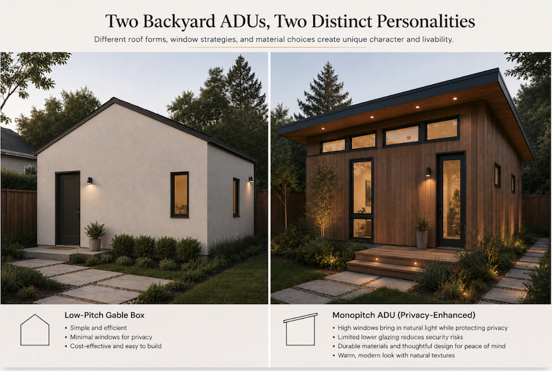
The five reasons cheap ADUs read as sheds
1. The roof gives it away first
The single most common tell is a shallow gable roof with no eave, dropped onto a rectangle because it is the cheapest truss package available. There is no overhang, so the roof edge dies flush into the wall with a thin fascia board. That detail — a flat, shadowless edge where the roof meets the wall — is the visual signature of a utility building. Your eye has seen it on every shed and every portable classroom you have ever walked past.
What good ones do: commit to a roof form. A confident single slope, a steeper gable with genuine presence, or a low form with a deep overhang that throws a real shadow line across the wall. Any of these read as intentional. What never reads as intentional is the apologetic shallow pitch with no edge.
2. Proportion — the box is maximized, not designed
When the only brief is get the most enclosed area for the money, you get a rectangle stretched to the size cap with a flat wall on every side. Nothing steps in or out. Nothing tells you where the front is. The building has no proportional relationship between height, width, and the openings in it.
What good ones do: trade a little area for form. A recessed entry, a covered porch cut into the volume, a slight step in the plan, or a taller ceiling in the main room and a lower one over the bathroom. These moves cost square footage and buy the thing square footage cannot: a building that looks composed.
3. Windows placed by the framer, not the designer
On weak ADUs the windows are all the same modest size, scattered at whatever height was convenient, misaligned with each other and with the door, and set flush in the wall with no reveal. The result reads as holes punched in a box.
What good ones do: establish a rhythm. Heads align across the elevation. At least one elevation gets a genuinely generous opening — a window wall or a sliding door to the outdoor space — which does double duty: it makes a small interior feel expansive and it announces from the outside that this is a place people live. Reveals are deep enough to cast a shadow. Small units can absolutely have fewer, bigger, better windows rather than more mediocre ones.
4. Siting — shoved to the fence, with no approach
The default is to push the unit as far back as the setbacks allow, face the door at the main house, and pave a straight path to it. There is no threshold, no sense of arrival, and the space between the two buildings becomes a leftover corridor rather than a place.
What good ones do: treat the gap between the buildings as the most valuable room on the lot. The ADU is turned to create a courtyard rather than a leftover. There is an approach — a change of paving, a bit of planting, a step. The entry is sheltered. Crucially, the two buildings acknowledge each other rather than standing back to back.
5. Materials that are thin, busy, or both
The cheap version uses the thinnest available lap siding, often in more than one material or color to add interest, with visible seams, ragged corners, and trim that does not resolve where two surfaces meet. Interest added at the end never rescues a form that was not resolved at the start.
What good ones do: pick a small palette — often one primary cladding plus one accent at the entry — and detail it properly. Corners are mitred or trimmed deliberately. Terminations are planned. The material runs continuously enough to read as a surface rather than a patchwork. Ordinary materials, placed well, beat premium materials placed carelessly every time.
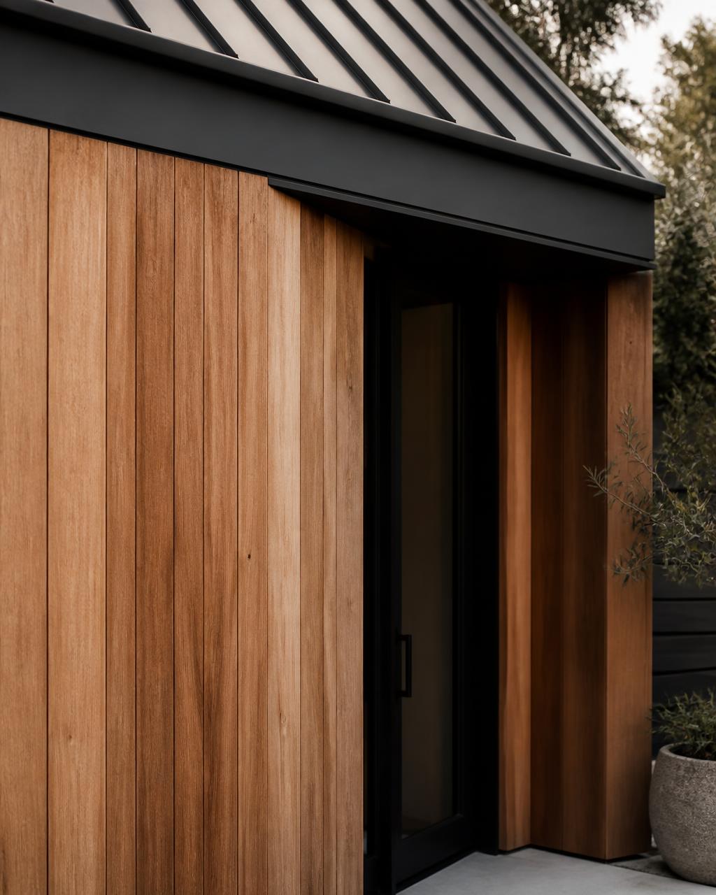
The design brief to hand your builder
Ask for these, specifically, in this order
- A committed roof form with a resolved edge — either a real overhang or a deliberately crisp termination. No shallow default gable.
- One generous glazed opening facing the best outdoor space, instead of four ordinary windows.
- Aligned window heads and consistent reveals across each elevation.
- A recessed or sheltered entry — the unit should have a front door, not a door.
- Siting that forms a courtyard between the two buildings rather than a leftover corridor.
- One primary cladding material, detailed properly at corners and terminations.
- A ceiling that does something in the main room — height, slope, or exposed structure.
- Landscape and hardscape included in the plan, not left as a later problem.
The trade-off nobody tells you
Every one of those moves costs either money or square footage, and square footage is usually the better thing to spend. A smaller unit that is well proportioned, well sited, and well detailed will look better, rent better, and feel better to live in than a maximized rectangle of the same cost. The instinct to fill the allowable envelope is the single most reliable way to end up with a shed.
It also means you cannot get this by choosing better countertops later. The decisions are made in the first few weeks, by whoever is drawing your building. Which is exactly why the next page exists: a checklist for telling that person apart from a general contractor with a stock plan.
Frequently asked questions
- Why do most ADUs look like sheds?
- Because they are optimized for the cheapest enclosed square foot. A low-pitch gable on a simple rectangle, small punched windows placed wherever the framing allowed, thin builder-grade siding, no eave, and an entry that is just a door in a wall. Each decision saves a little money and each one removes a signal that the building is a home. Together they produce something the eye reads as storage.
- What makes an ADU look like real architecture?
- Five things, in rough order of impact: a deliberate roof form with a resolved edge; correct proportion and a plan that is not just a maximized box; a window rhythm where openings align and are generously sized on at least one elevation; siting that gives the unit an approach, an entry and an outdoor room rather than shoving it against a fence; and a small palette of honest materials detailed carefully at the corners and terminations.
- Do I need an architect to get a designer ADU?
- Not necessarily an independent architect, but you do need someone doing actual design work on your specific lot rather than adapting a stock plan. Some design-build firms have strong in-house designers and produce genuinely good buildings. What you cannot skip is the design hours themselves — that is the input that produces the result.
- Does a designer ADU cost much more?
- It costs more, but most of the premium is design time and envelope decisions rather than expensive materials. The features that make a small building look intentional — roof form, window proportion, careful cladding details, a real entry — are largely ordinary materials assembled with more care. Reducing square footage is usually a better way to protect a budget than reducing design quality.
- What is the single highest-impact design decision on an ADU?
- The roof. It is the largest single element, it is visible from everywhere in the yard and often from the street, and it sets the character of the whole building before anyone notices the siding. A deliberate roof form with a properly resolved edge does more for a small building than any interior finish choice.
Next: how to find someone who builds this way
The builder checklist turns everything on this page into eight questions you can ask on a first call.
Send your ADU details